Von Westendorp Approach Using Python
(Artificial Intelligence Series)
Strategic pricing is a critical process of Product Management, when it comes to launching a new product. There are many methods to pricing your product and one of the most popular ones is the Von Westendorp approach. The beauty of this approach is that it provides a glimpse in the form of a “Price Sensitivity Meter”. Once the graph is plot, we get the following price points at the intersections:
a. OPP (Optimal Price Point) – The ideal price where the consumer is most willing to pay.
b. IPP (Indifference Price Point) – The price where the consumer is least willing to pay.
c. PMC (Point of Marginal Cheapness) – The price beyond which the consumer will consider the product to be too cheap and might not consider buying.
d. PME (Point of Marginal Expensiveness) – The price beyond which the consumer will consider the product to be too expensive and might not consider buying.
From the above four price points, we get the RAI (Range of Acceptable Index); which can be used to price our product. All said and done, let’s get our hands dirty now!
A survey is conducted to assess the likely price points with questions like:
· At what price would you consider the product to be too expensive and out of reach? (Too Expensive)
· At what price would you consider the product to be expensive but still worth buying? (Fleecing)
· At what price would you consider the product to be a cheap and worth buying? (Bargain)
· At what price would you consider the product to be too cheap that quality would be doubtful? (Too Cheap)
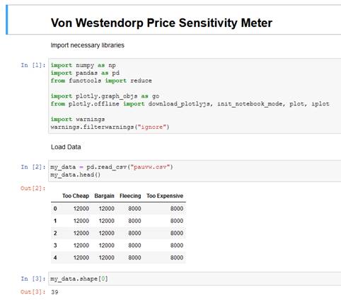
All the responses are collected and the dataset is arranged in the following manner:
Please note that the first two columns are sorted in descending order while the last two are sorted in the ascending manner. Using this dataset, one can plot the Von Westendorp graph in excel itself. While this might seem quite easy and does not require any other dependencies like a Python IDE; I personally detest doing it in excel. I will explain the reasons at the end of this article.
I’ve used Miniconda CLI, Jupyter notebook and .csv data format for this project. You may choose other IDE and tools that you are comfortable with like Spyder, NoSQL, etc.
Launch a fresh notebook and import the necessary libraries. Now, load the data and check the shape as shown below:
Next step is to remove the intransitive price preferences* and compute the cumulative frequencies, as shown below:
Once the above is done, we need to define a table where all the array values can be tabulated.
Now, we need to compute the results and get the values, as shown below:
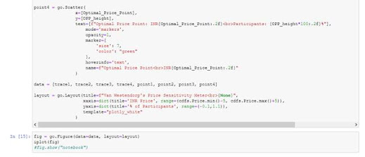
The last step is to plot the graph:
The output graph will look like this:
So, that’s it, pretty simple, isn’t it? Well, no. It wasn’t that easy when I did it for the first time. Let me share my learnings with you. Prior to plotting it in Python, I did it with excel. I’m presenting a comparison table of the values that I got:
One can easily note that the values arrived at via Python are higher than those from excel. The reason being the following:· In Excel, it will accept all price points from the dataset as it is, in order to plot the graph while in Python, I have the freedom to “remove intransitive price preferences*”. If I had skipped this step, values from Excel would match those from Python.
· It is imperative to remove the intransitive price preferences as not doing so would present a skewed graph, as well as, generate incorrect values.
· As a result, my data shape dropped to 16 from 39; meaning entire 23 rows were invalidated.
The obvious question that would arise in the minds of data analysts and machine learning enthusiasts is – Why not scale or normalize the dataset?
The answer is plain simple here – applying normalization to the dataset would replace the suspect values (intransitive, duplicate, etc.) with the average or mean. Since, this is akin to “changing the respondent answers”, it would amount to gross manipulation of data and render the purpose of survey useless.
Thus, the key takeaways from this exercise are:
1. Statistical inferences are better accomplished with Python than with Excel
2. Respondents are prone to error and one might need to drop off the incorrect answers
3. Adequate sample size is a must to ensure that there are enough data points to suffice for the inference
4. Scaling or normalization is not a ‘one size fits all’ solution and must be applied with sufficient caution
5. Intent needs to be preserved even if it is at the cost of the content
Note: *intransitive price preferences – the price points that are not linear but are concurrent. This can happen where a respondent might choose the same price point for more than one question. For e.g. Rs. 8000 selected as ‘bargain value’ as well as ‘too cheap value’.
P.S. You can contact the author to know more about this article. The sample python code is available at https://github.com/southpau79/humintonline .
For those lazy to read & have scrolled to find the end of page, here's the video:


